Client:
Redesign the label of Sokol beer
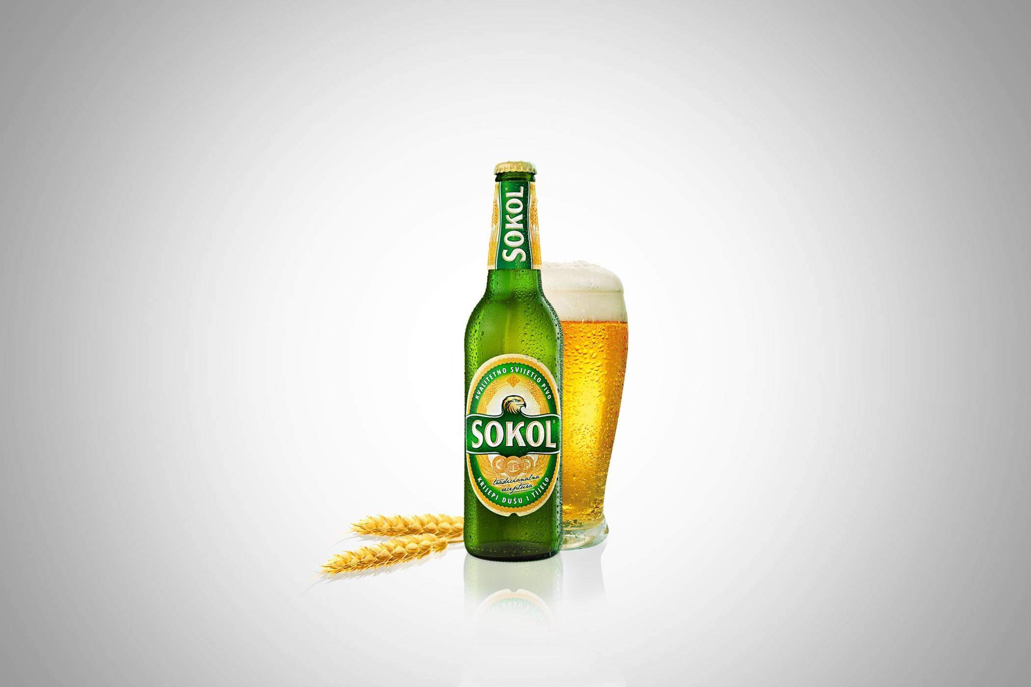
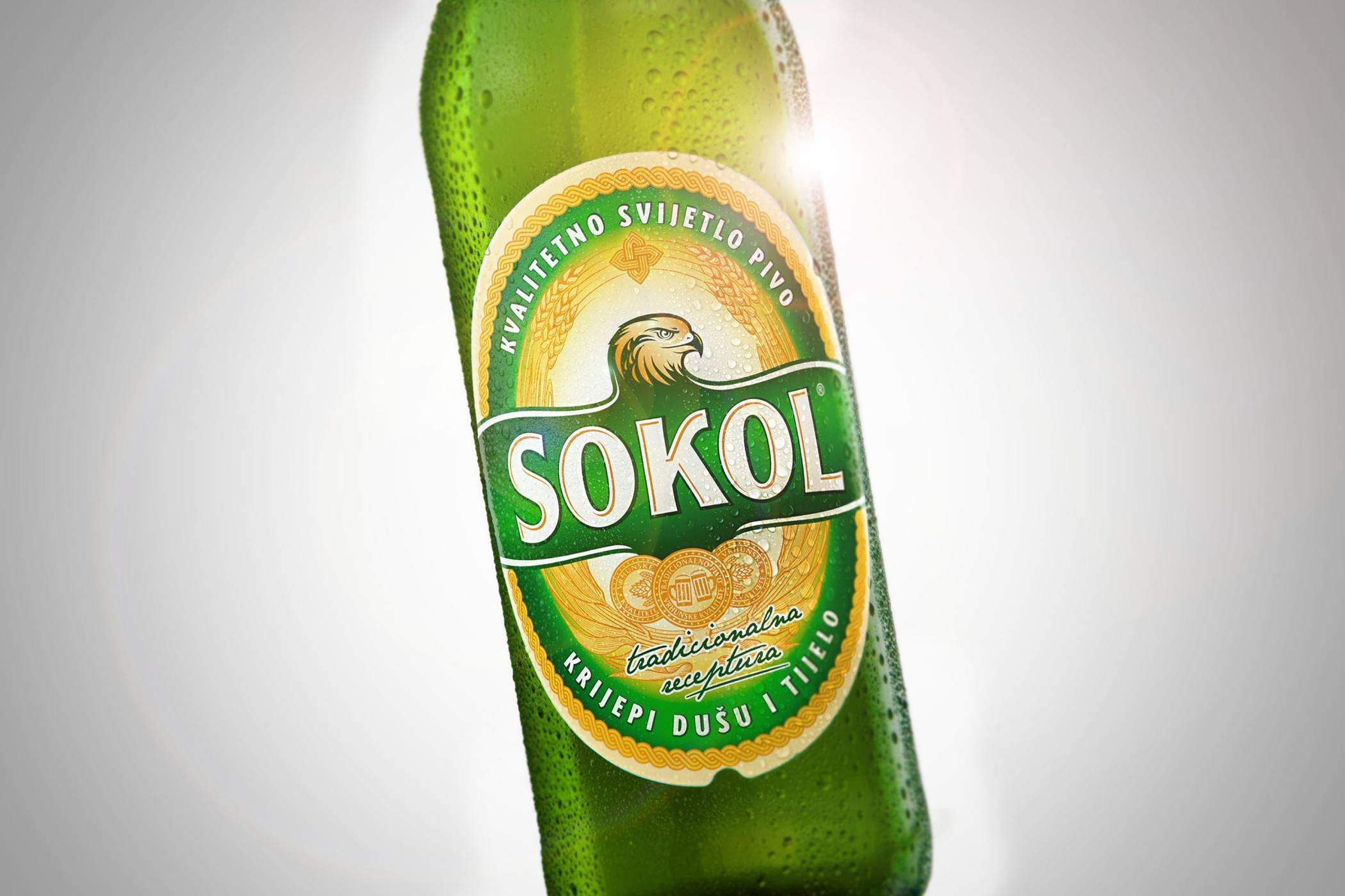
After a hard day of work, people who are engaged in traditional occupations need some delicious refreshment. Sokol beer is designed exactly for them, but despite it’s initial success in the market, the design had to be refreshed. We have introduced elements of PLETER that emphasize tradition, we put more emphasis on the picture of barley that testifies to the quality, and the head of the falcon and the name were merged together, giving the impression of outspread wings. The falcon (Sokol) can proudly continue its flight.
Consulting, Packaging graphic design, Prepress, Visual identity