Client:
Coming up with a creative solution for the redesign of the Tortica brand and uniting different products (Tortica “classic” and Tortica “finger”) within the same creative solution.
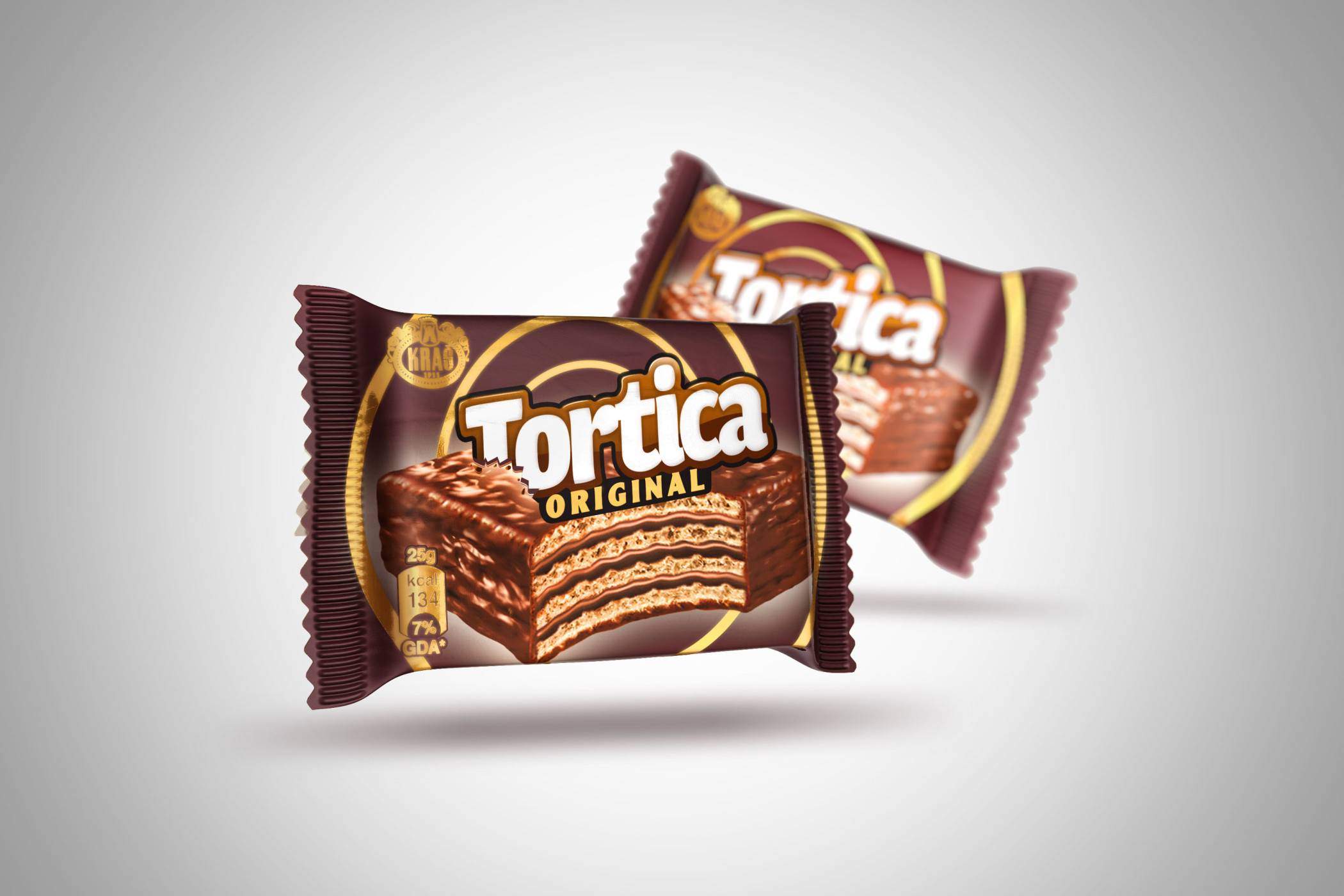
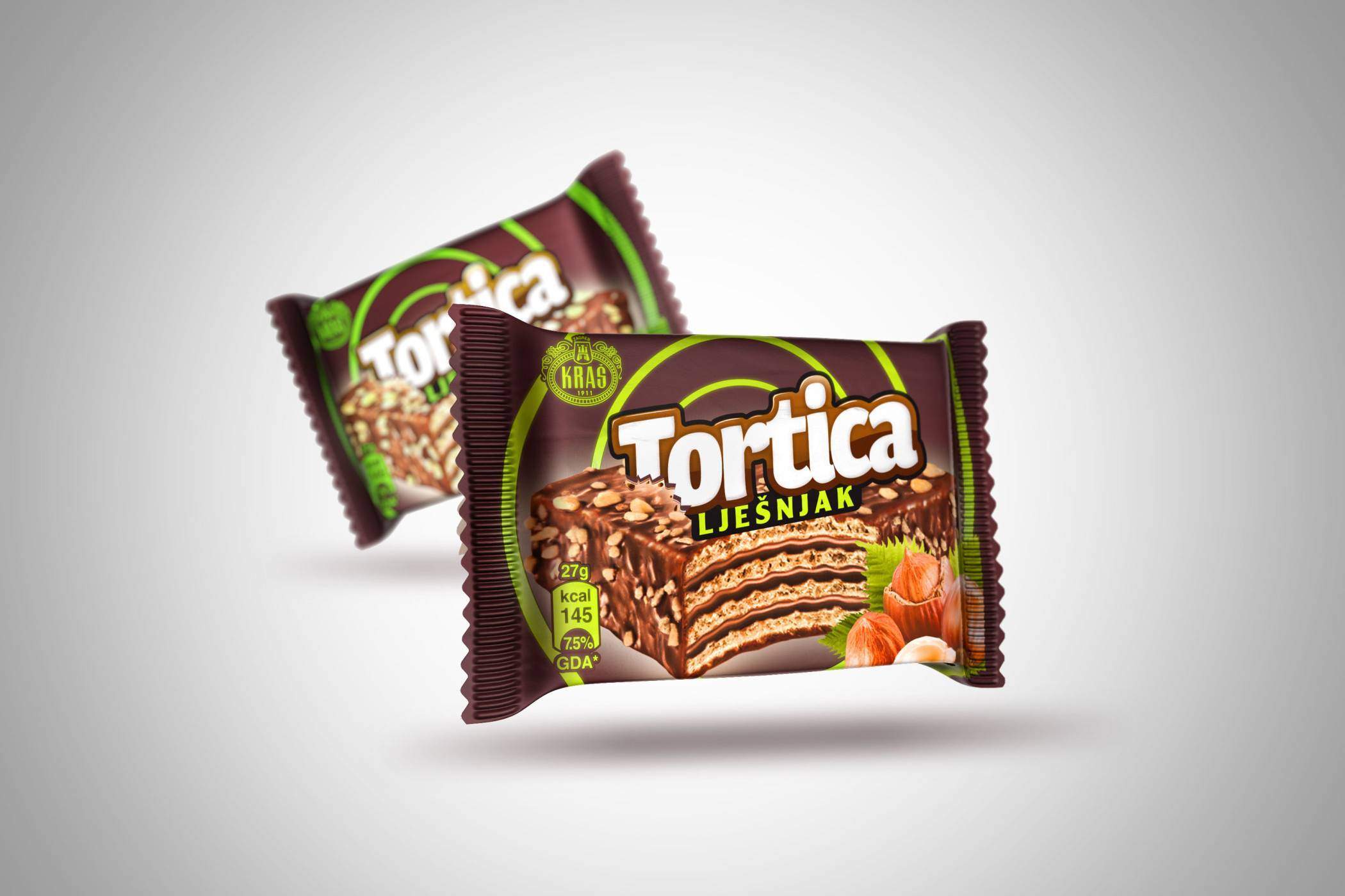
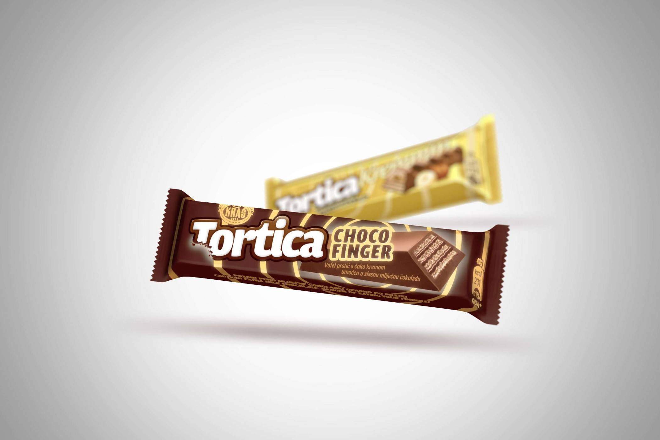
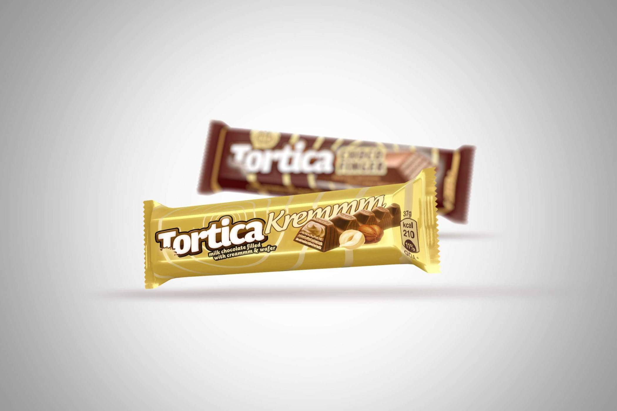
The spirals on the Tortica wrapping were there since 2004, as part of the concept of hypnosis that suggested that Tortica was the sweetest temptation, with the slogan “Do NOT think about Tortica”. The new creative concept gave the popular product a premium look (it emphasised dark lettering and dark chocolate filling) and made it more dynamic and appealing to the younger population. The logo also received a makeover in which part of the letter T looked bitten off so as to convey the irresistible nature of the waffle. The new cream product (Krem Tortica) was successfully incorporated into the existing line, and the only one to receive a cream-coloured wrapping (instead of the brown one), to emphasise its creamy component.