Client:
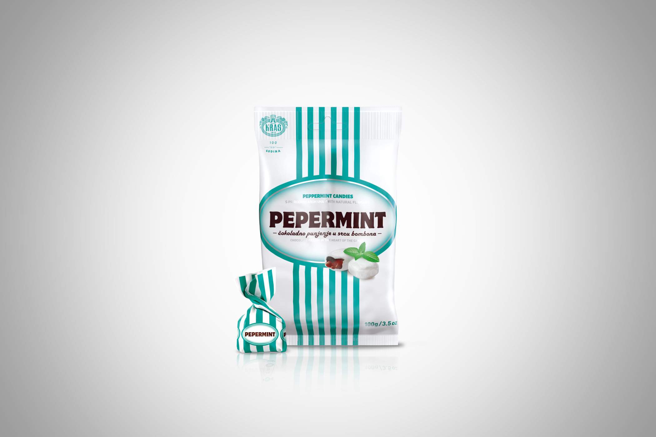
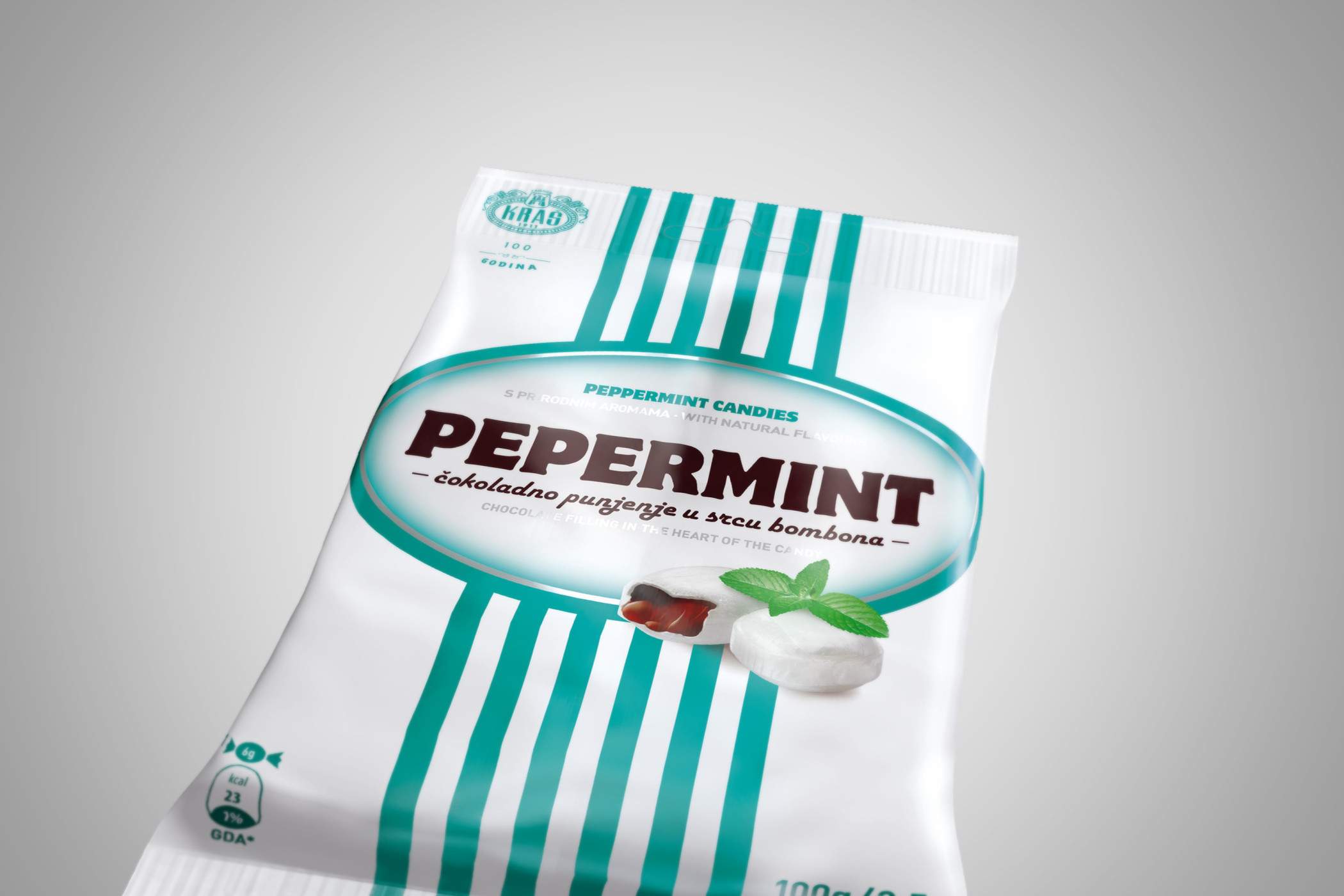
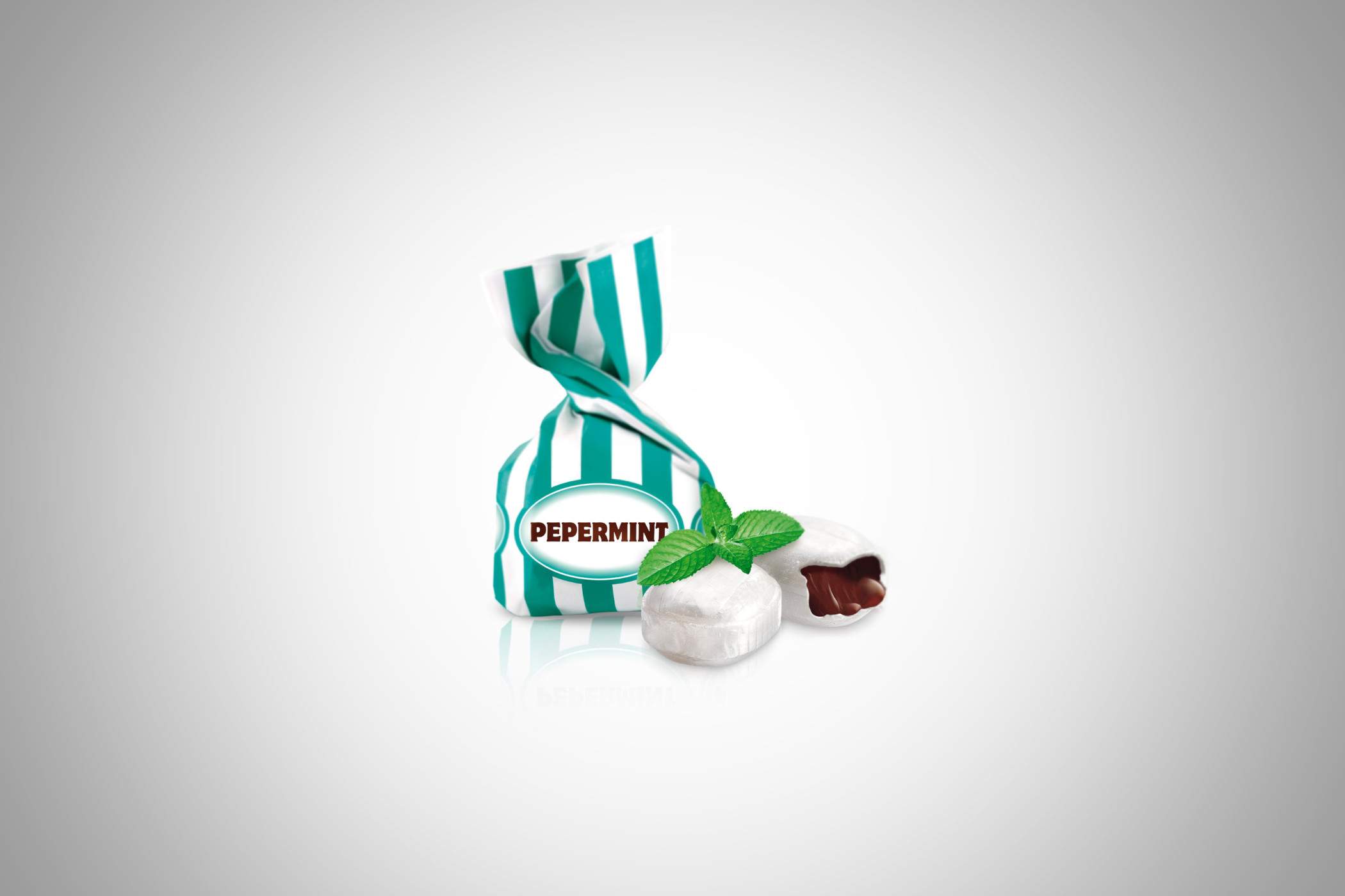
Retaining the positive recognisable elements of this product with a long-standing tradition and introducing some changes– a throw-back style that will invoke nostalgia and longing for the past, and make the product stand out on the shelves with its more appealing design.
We redesigned the packaging of the Pepermint mints by retaining the recognisable, prominent striped white and green element that was part of the previous bag design, and introducing new elements in the logo, the slogan and the images of the mints on the package and wrapping. The packaging features retro stylings, and the colours white and green (that is, mint) symbolise the refreshing sensation of the herb.