Client: TD Opatija
Creating and designing the visual identity of the brand destination Opatija Riviera and all of its components. Part of the task was to create an umbrella modular logo that would represent the entire Riviera, and from which logos of each individual town with its landmarks could be developed organically.
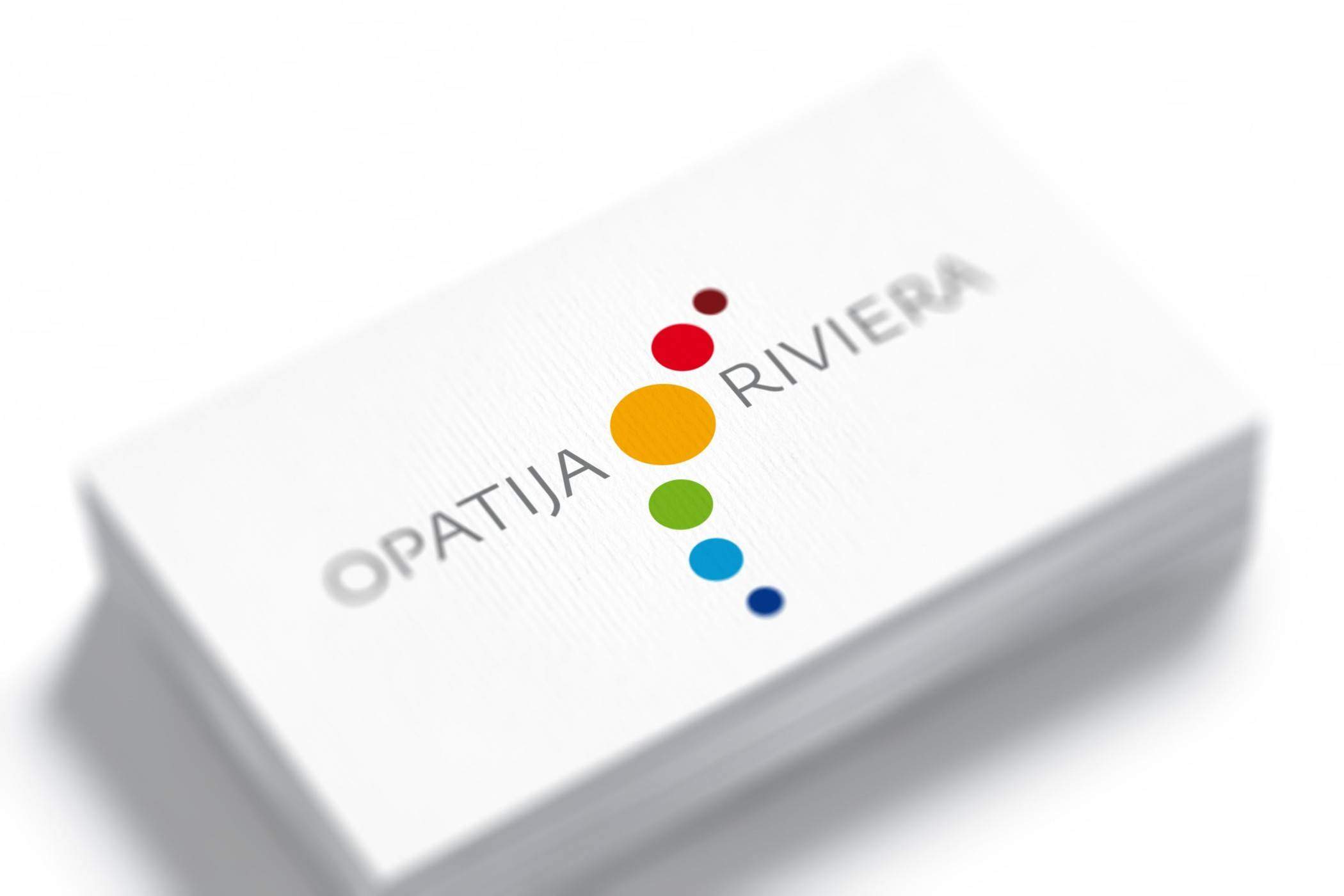
Nothing beats finding a simple solution to a complex problem. That is why we have created a simple stylised logo that represents every town and city of the Opatija Riviera and reflects their actual geographic alignment, with Opatija as the focal point. A colour palette ranging from warm brown and yellow hues to the colder green and blue ones was used in order to convey the combination of continental and Mediterranean flair that these destinations embody. Using photos instead of graphic symbols, the logo can be transformed easily into a communications sign for different events that the Opatija Riviera offers to its visitors.