Client:
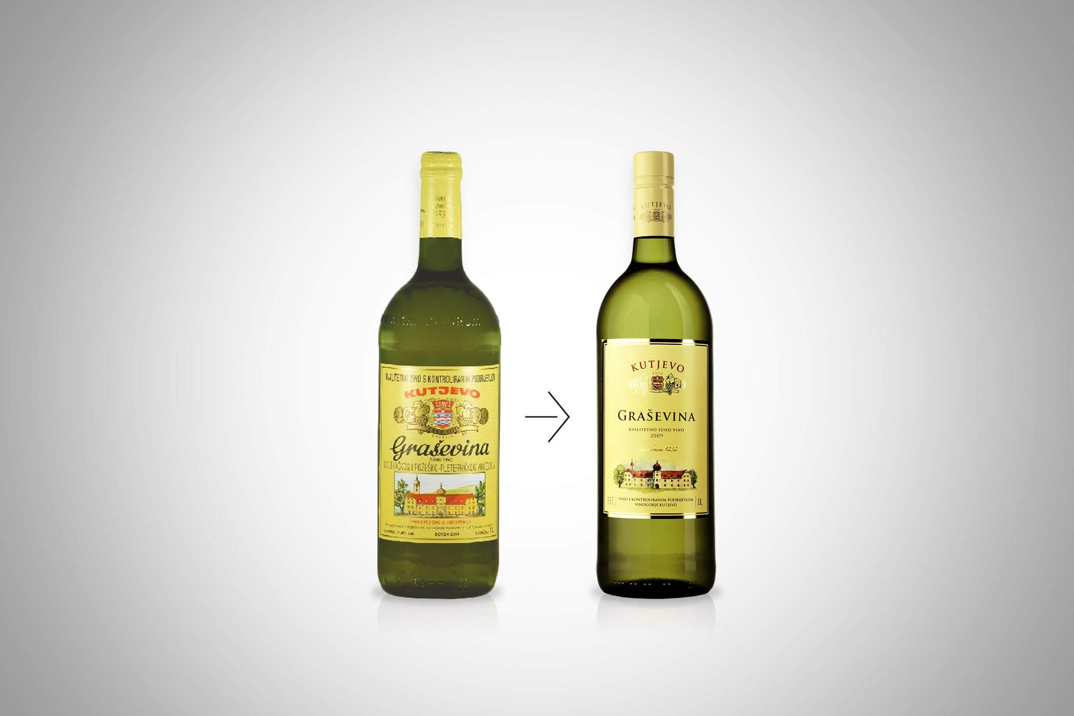
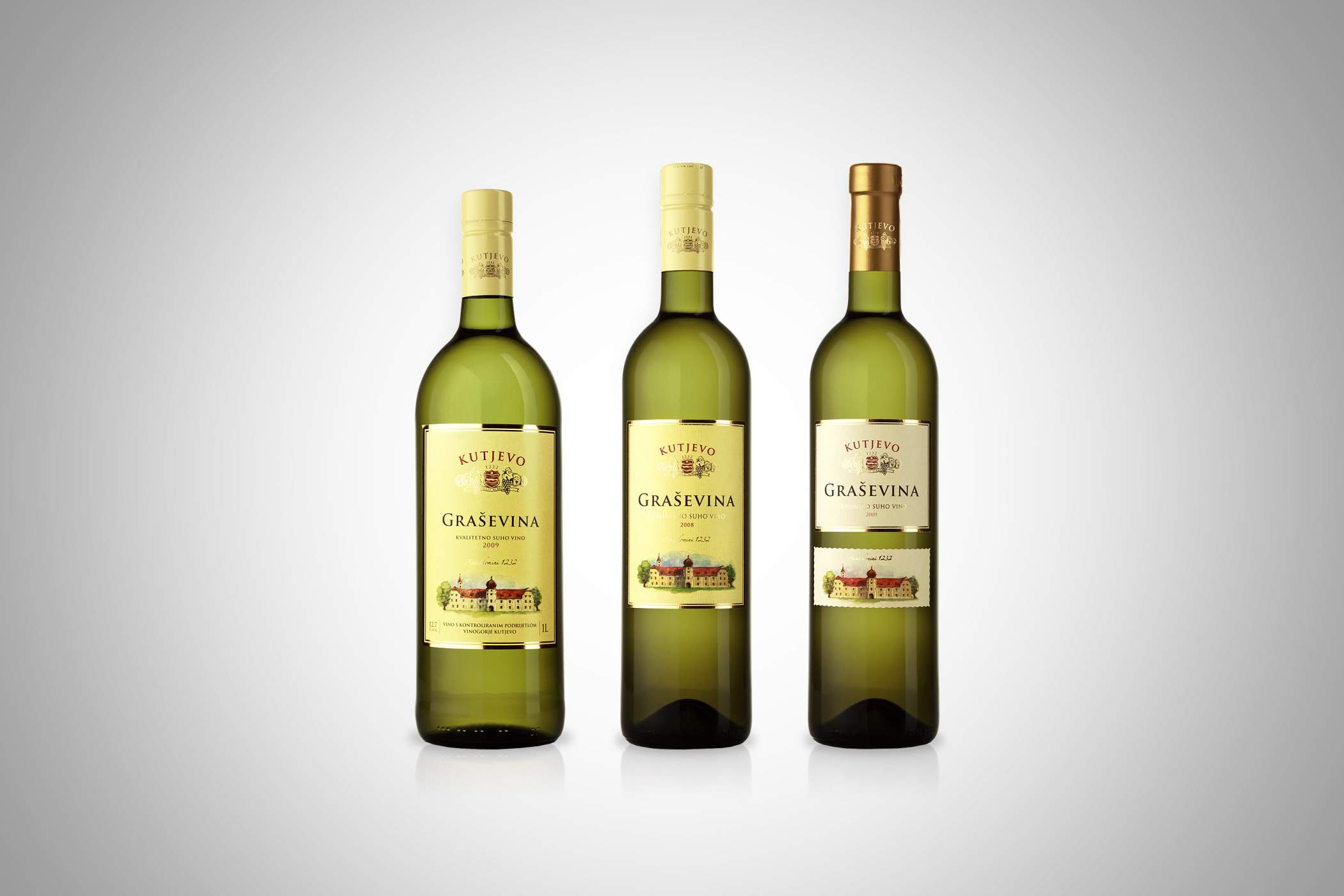
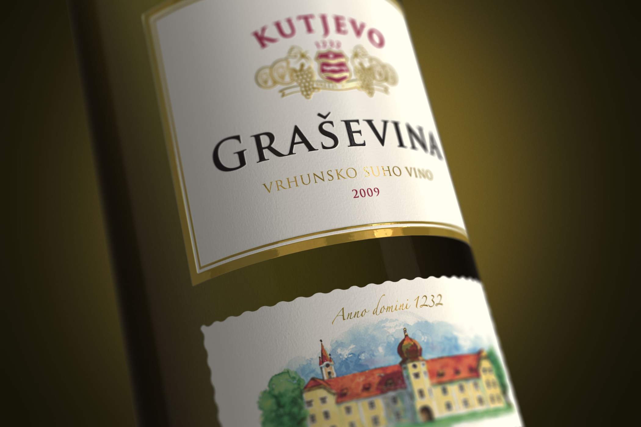
Coming up with new labels for Kutjevo wines that will retain some previous elements like the recognisable image of the Kutjevo castle and the colour yellow for their Graševina wine.
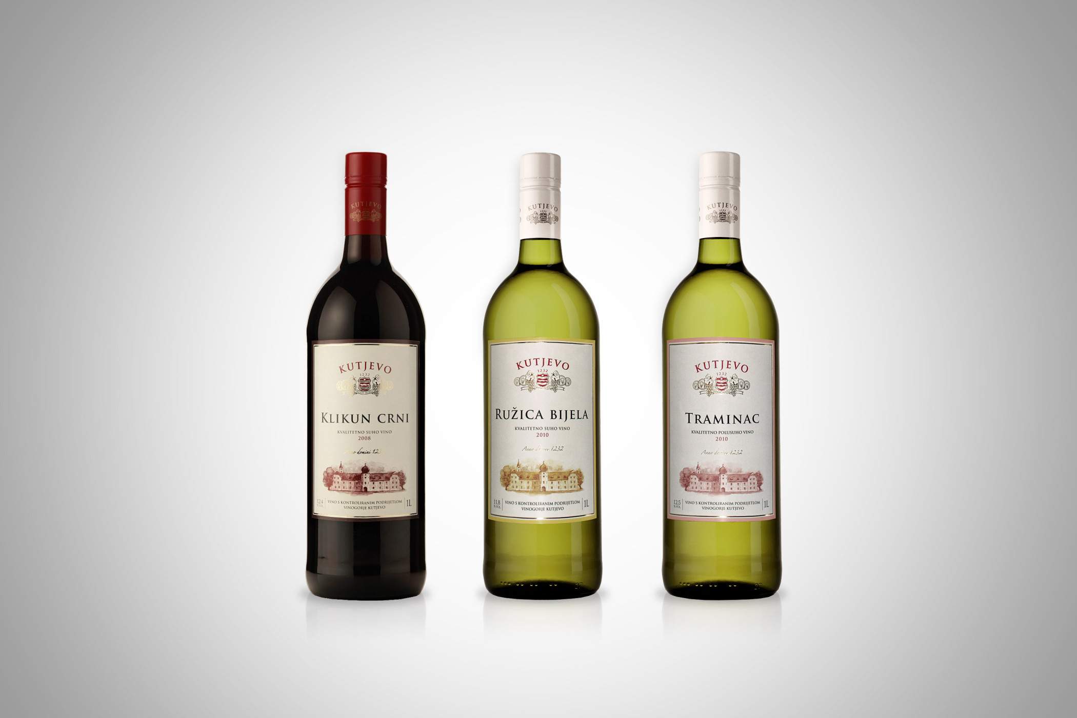
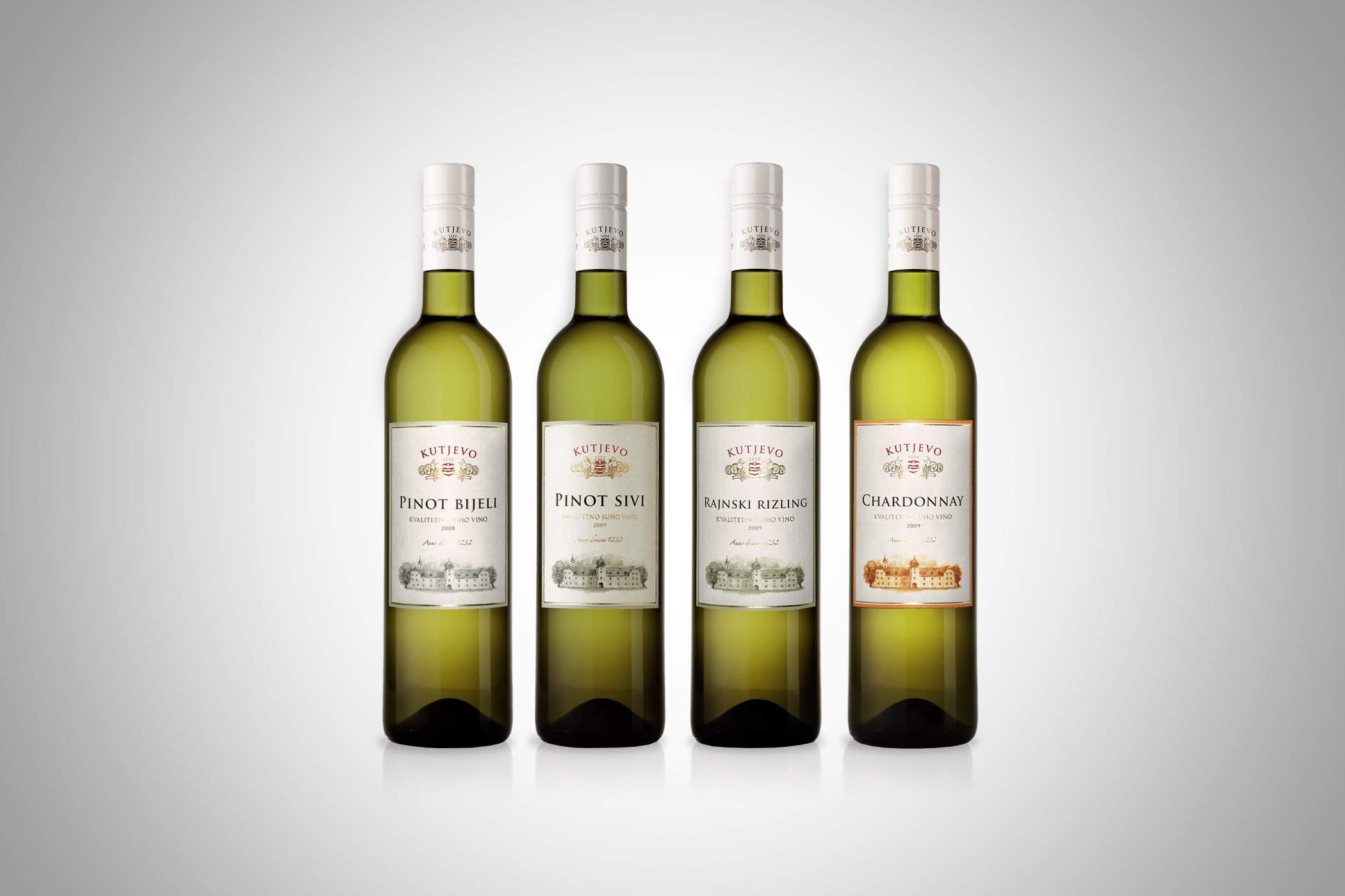
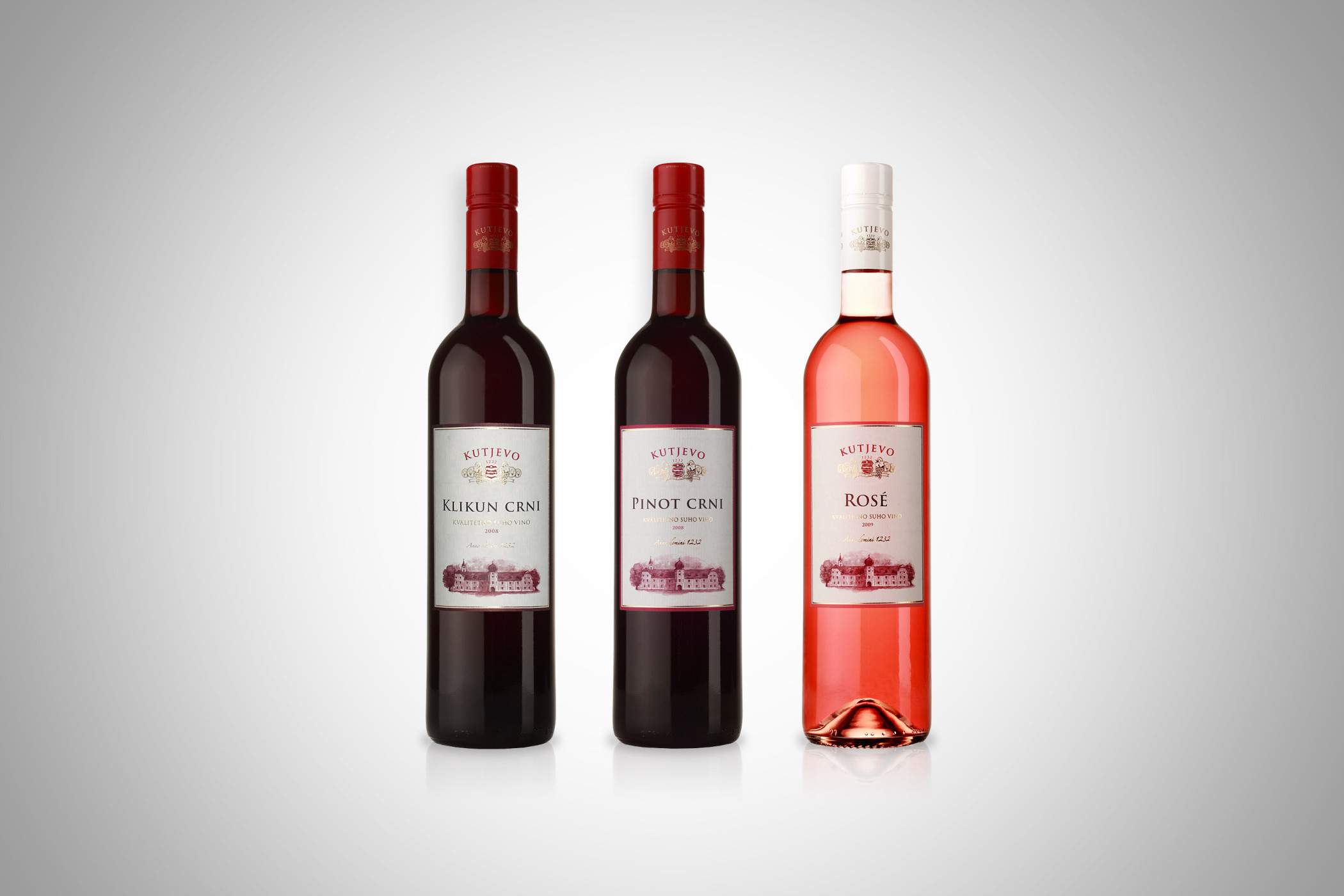
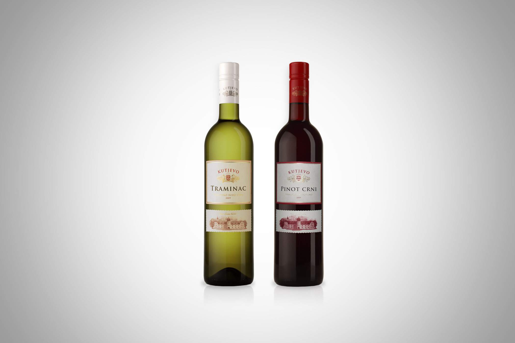
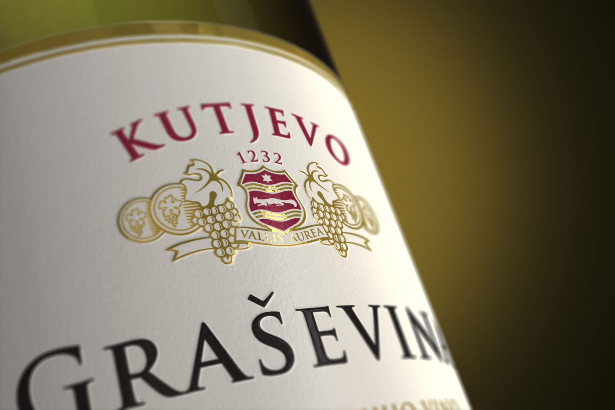
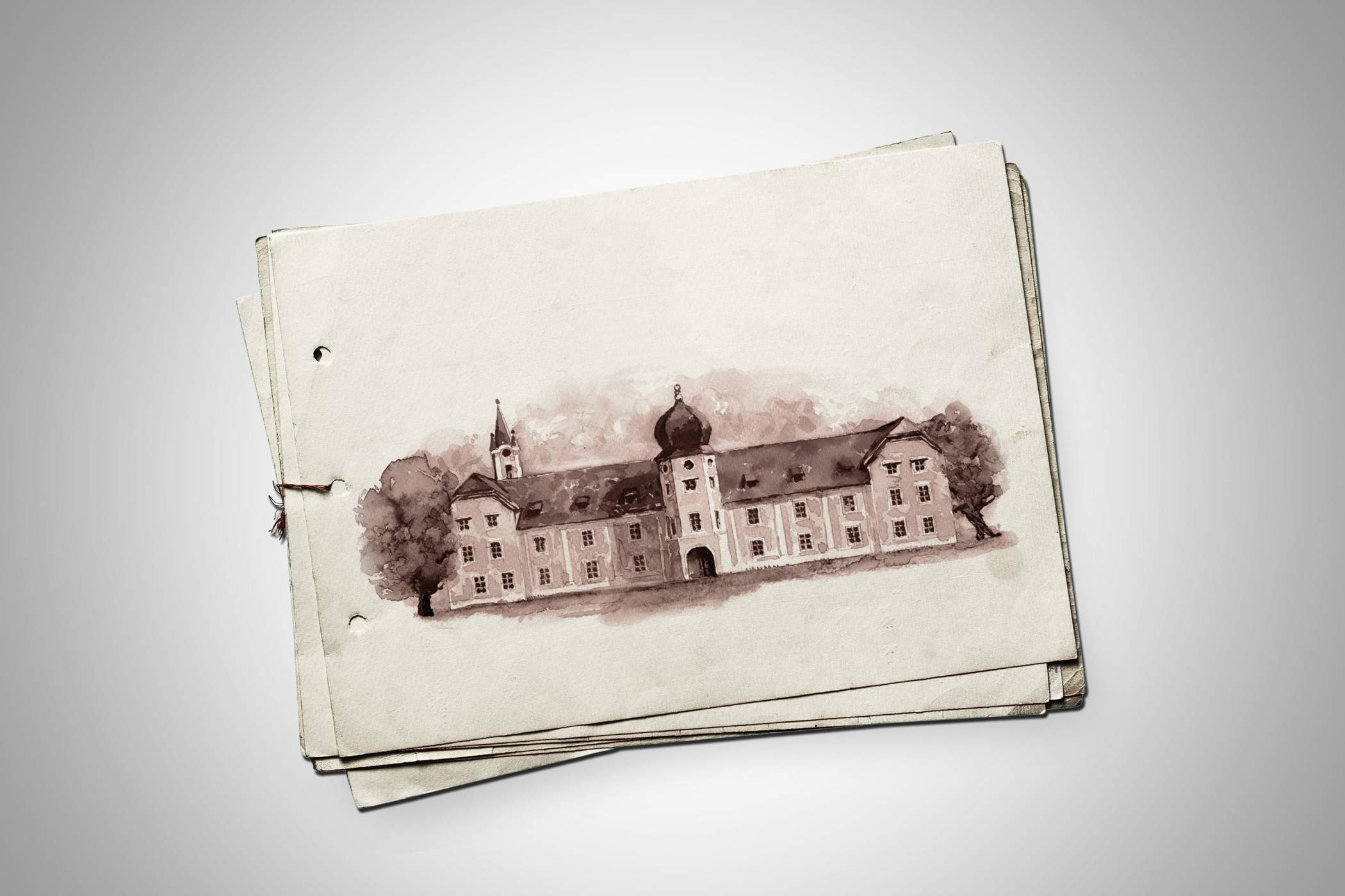
The aim was to create a visual identity that will emphasise the different categories of wines, but retain the recognisability and coherence of the whole range. Furthermore, Graševina (made from the popular local white variety of the same name) needed to be set apart from its competition and featured as Kutjevo’s biggest wine. The core values of the Kutjevo winery were communicated through sophisticated design, and the number of elements on the label was reduced. The basic values were communicated using the gold screen printing (quality), the image of the Kutjevo castle shown as if on an old postcard (tradition), higher quality paper, and the coat of arms that symbolises nobility and high rank (wealth). An additional element that we played with was the colour of the screw caps, which help the consumer tell whether the wine in the bottle is red (red cap), white (white cap), or Graševina (golden cap).
Brand positioning, Consulting, Packaging graphic design, Prepress, Production support, Visual identity