Client:
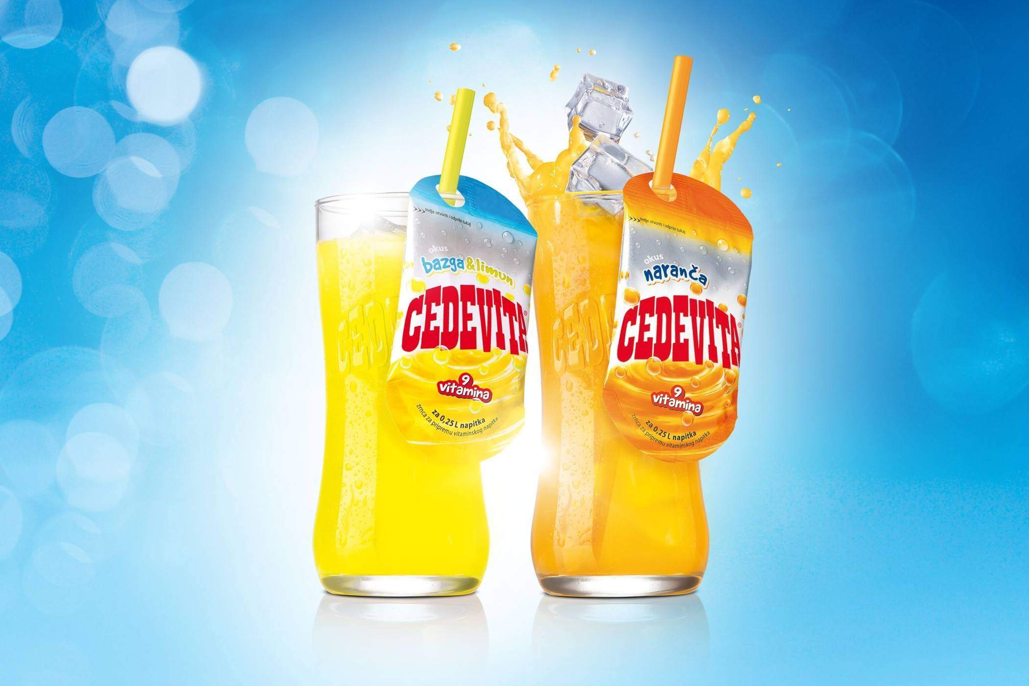
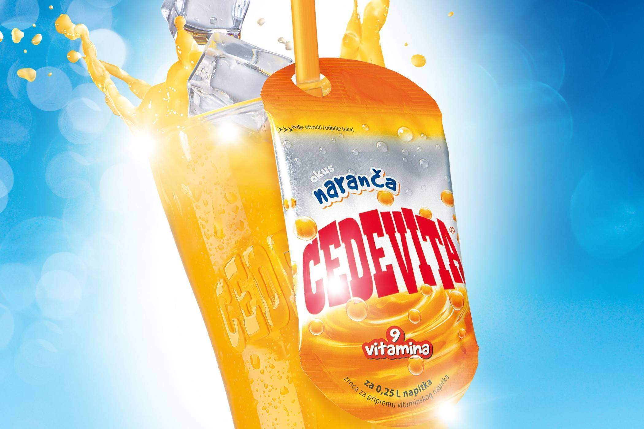
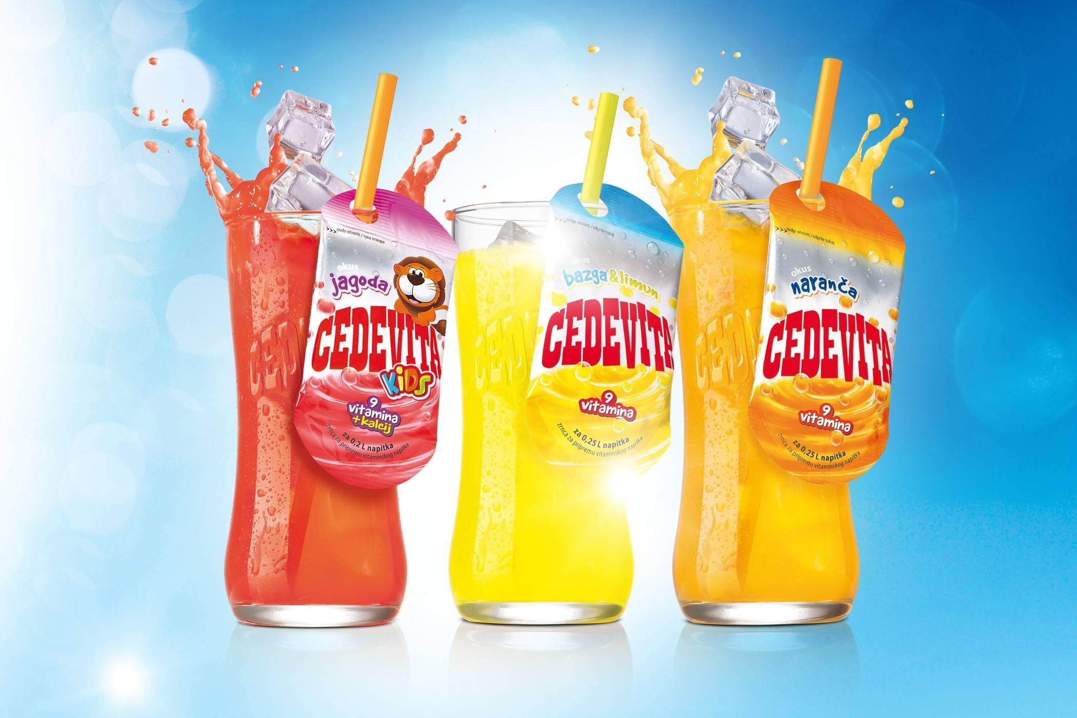
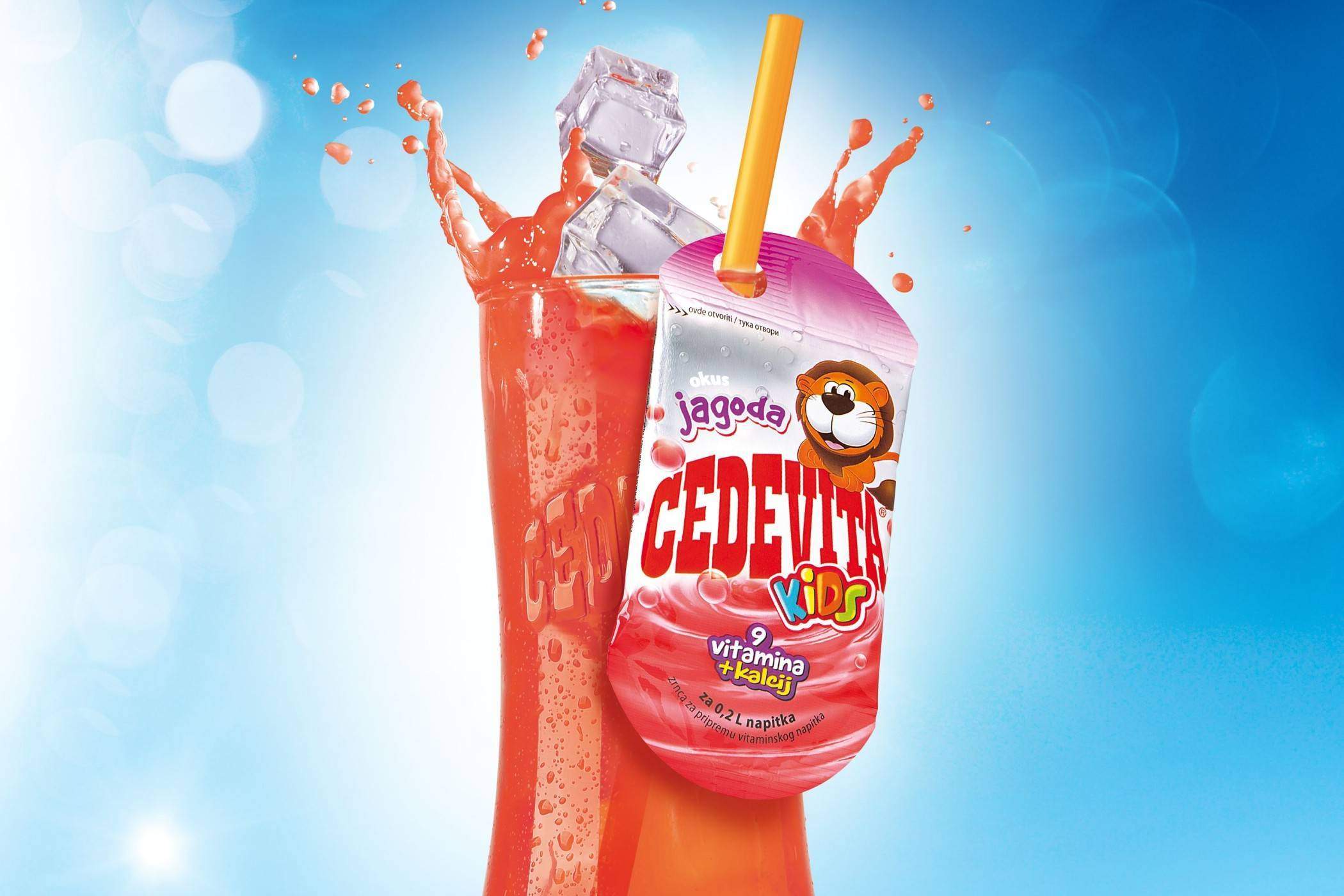
Redesign of the Cedevita packaging for HoReCa channel. The final product has to increase the value for money in the eyes of consumers, it has to have a more visible branding, a unique way of serving in comparison to the competition in order for the level of enjoyment in Cedevita to be raised to a new, higher level.
Using innovative and effective solutions, the new sachet, using a straw which is already a part of the serving of Cedevita, transforms the product into a visual delight that is easily noticeable and memorable at the point of sale. We emphasized the refreshing effect of Cedevita with a combination of the whirlwind already known from other packages and the silver color that symbolizes ice and the dew-cold glass in which it is served. We achieved the distinctiveness of flavors with a color code.