Client:
Redesigning the packaging for a range of Cedevita instant vitamin drinks. The wish was to make the design dynamic, proactive and bright and that the packaging embodies the brand values: refreshment, vitamins and frugality.
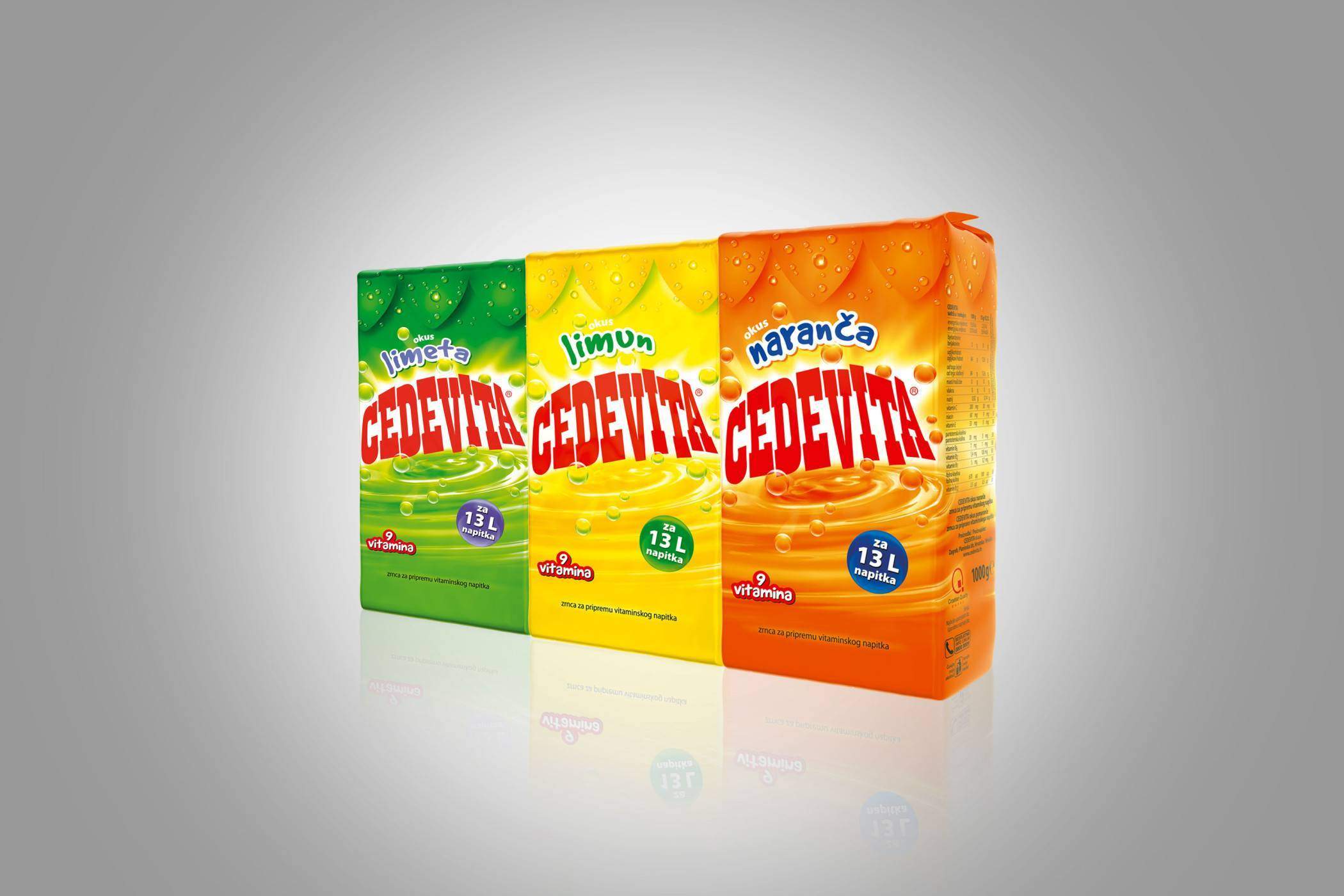
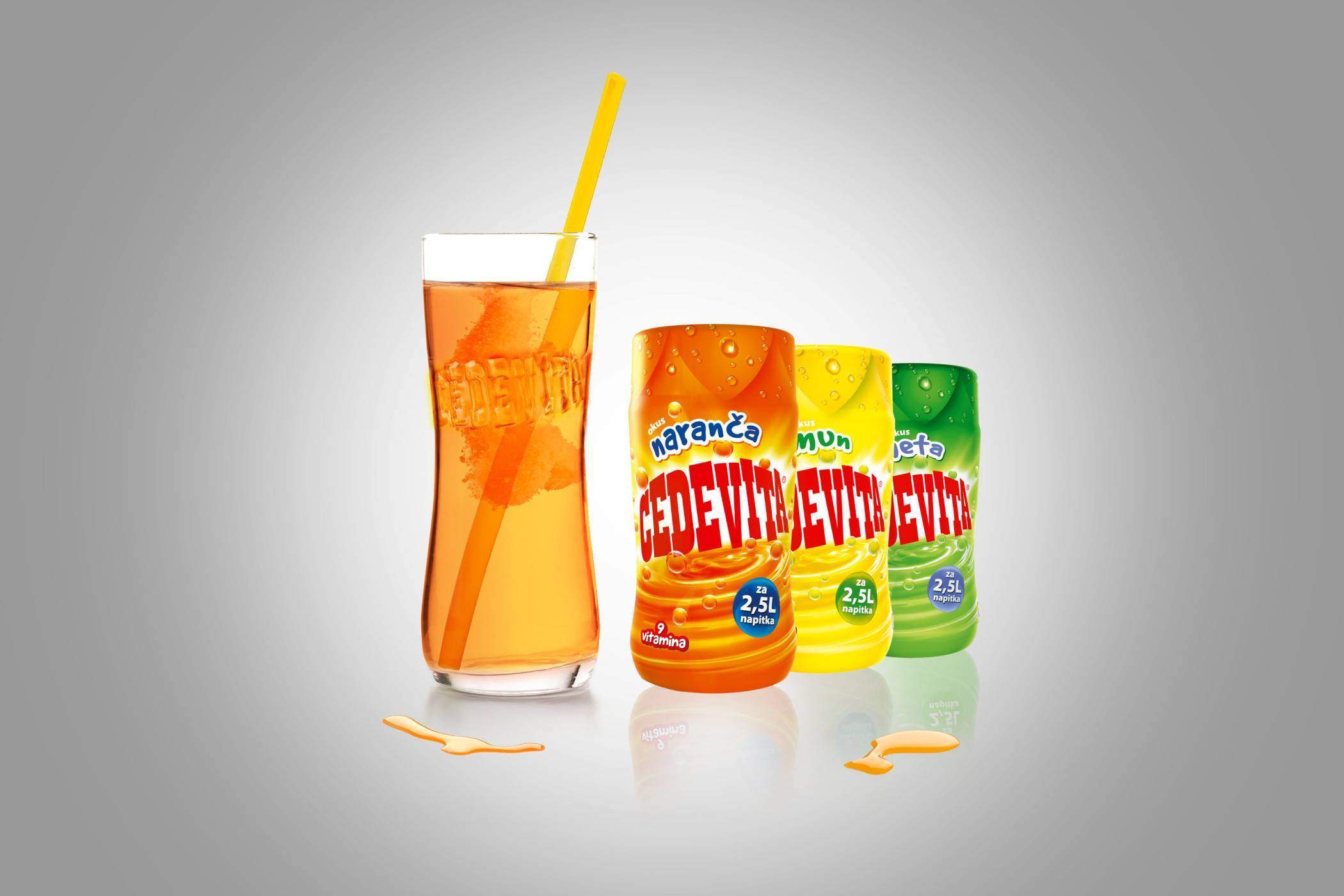
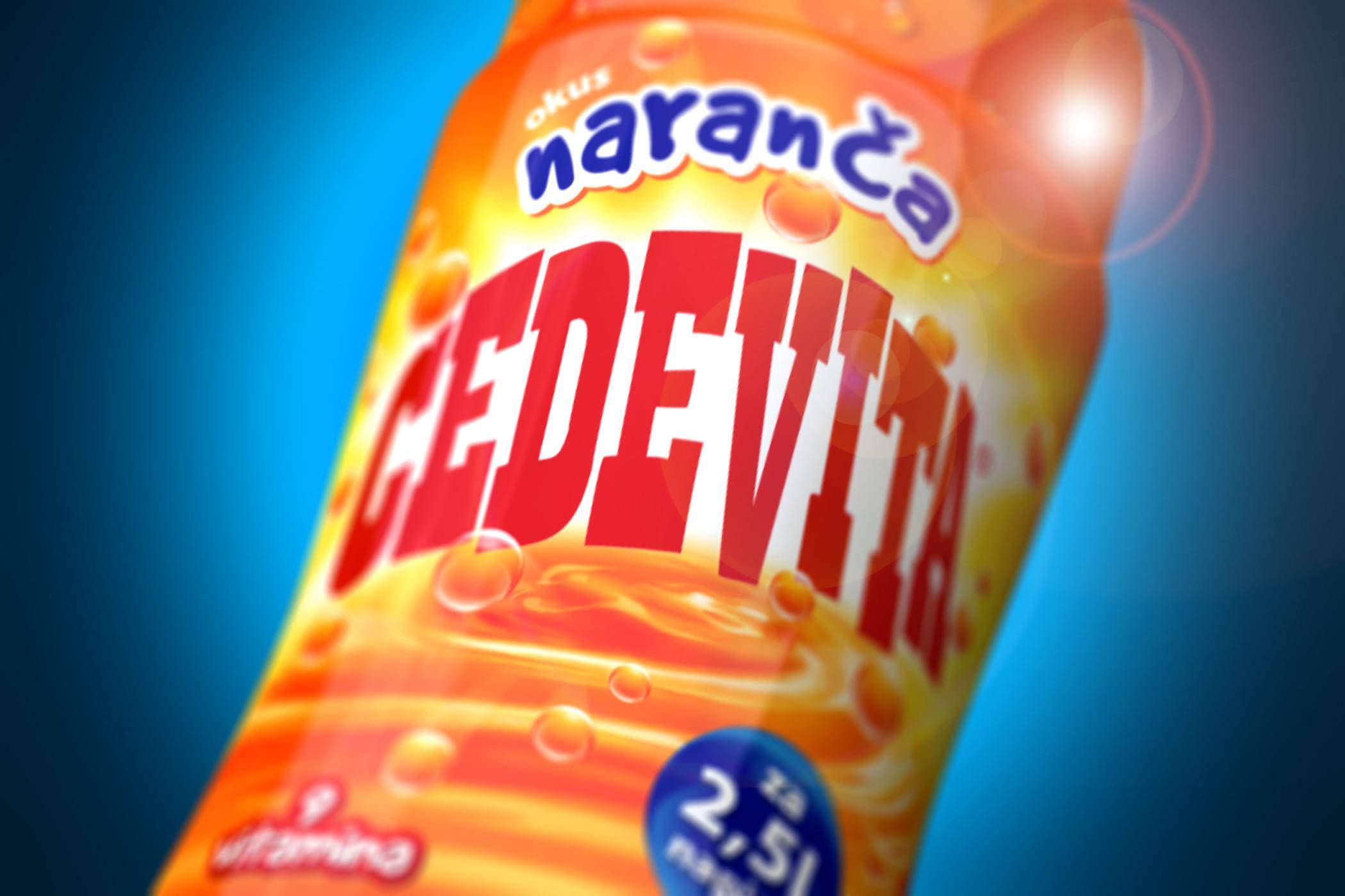
In order to emphasise the freshness of the drink, we have displayed a swirl of refreshment of a freshly prepared Cedevita drink. Drops of the fresh drink spray out of the whirlpool and convey the dynamism and energy of Cedevita and the vitamins it contains. The natural quality is embodied in the image of fruit peels that is featured of the top of the packaging. The opening of a package of Cedevita thus provides a feeling similar to peeling an actual piece of fruit. A new icon emphasised the quantity of the drink prepared – a piece of information that isn’t yet sufficiently present in the mind of the consumer. The distinction between different flavours was attained by colour coding the packagings and putting different caps on them that represented the top parts of different fruits.
Packaging graphic design, Prepress, Production support, Visual identity