Client:
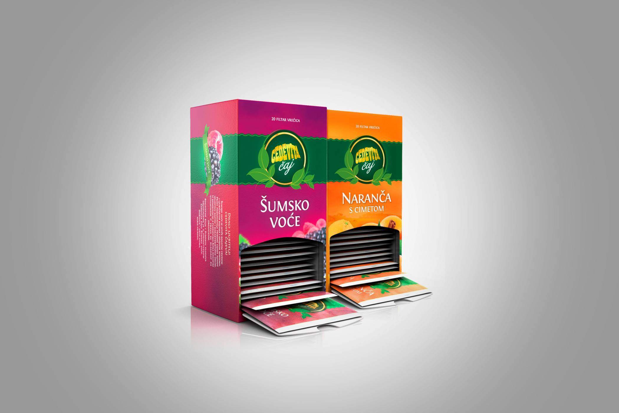
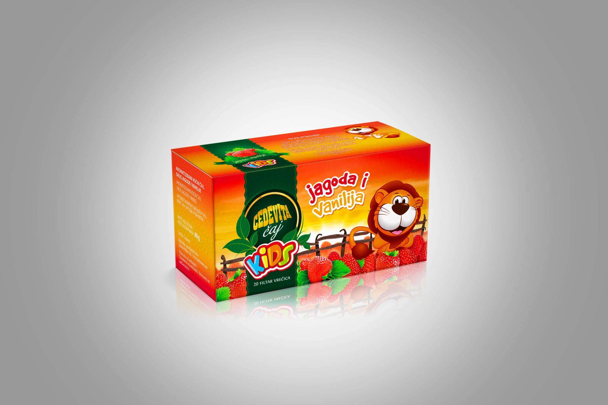
Redesigning the packaging of the Cedevita tea range which will reflect the richness of aromas and tastes and evoke moments of experiencing them. The all-natural quality of the teas was also an important element in the design process.
Moments we share with those close to us are moments we also often drink tea. This is when we are at ease and feel natural, at peace, warm and satisfied. These natural, honest and pure values were key to our packaging.
By choosing warm colours, simple fonts and adding a green strip that is featured on every box of tea in the range, we have managed to avoid a cold, corporate look and give the Cedevita teas a homey, natural look, with a hint of that fairytale feeling every moment in which we drink the tea will be infused with. Each packaging is dominated by the image of fruit or herb that the tea is made of to emphasise the vast richness of scents and tastes contained in the small bags.
Consulting, Packaging graphic design, Prepress, Visual identity