Client:
Creating packaging design for the brand called Bodega Vitamins & Minerals.
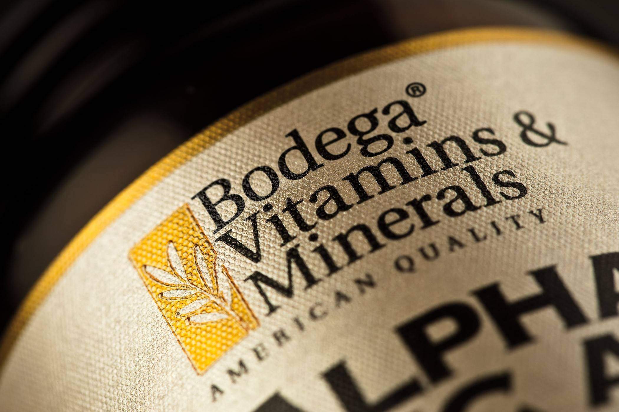
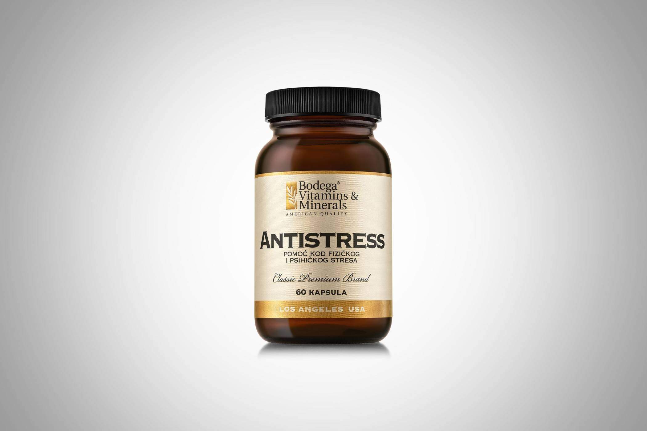
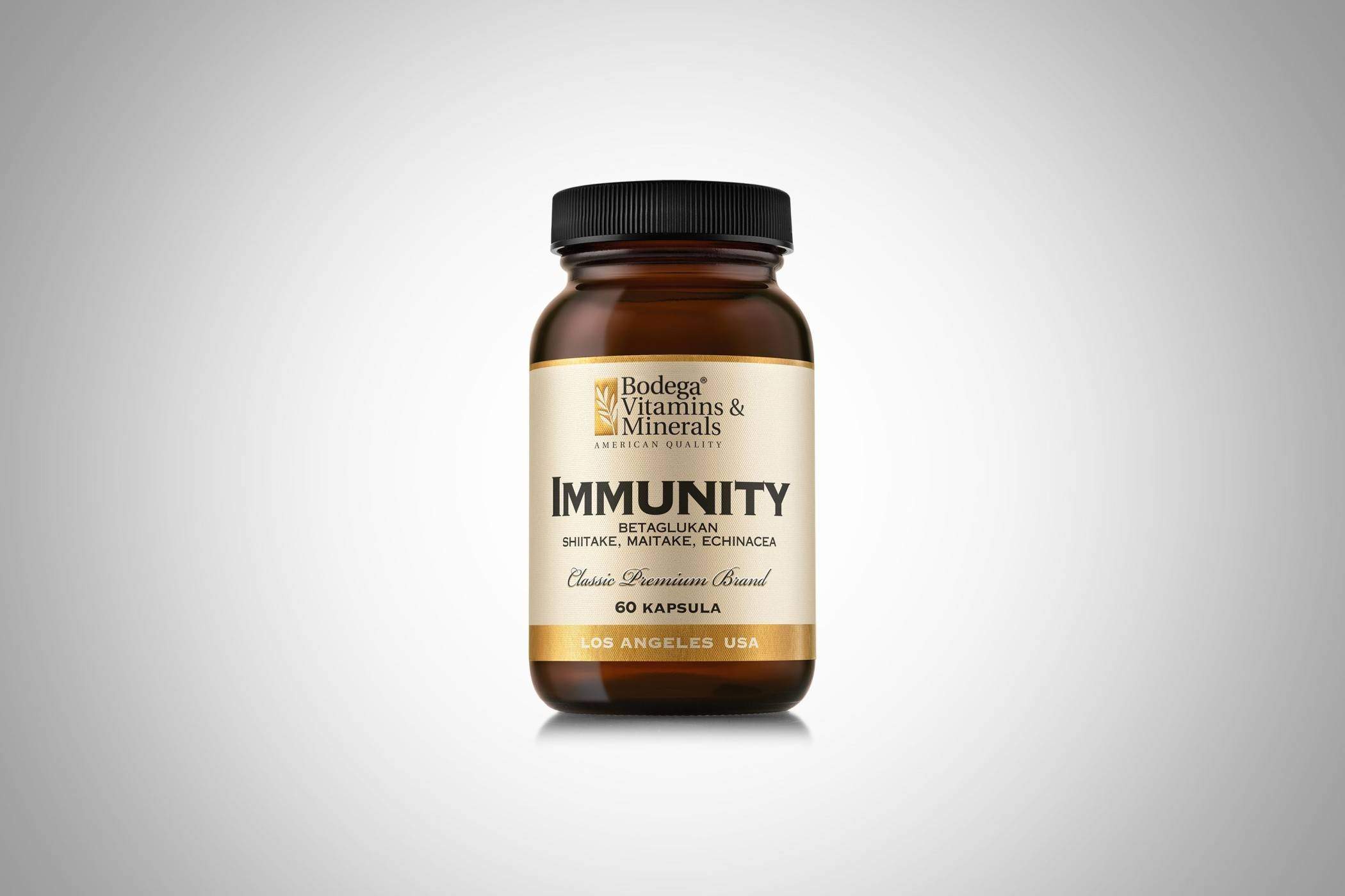
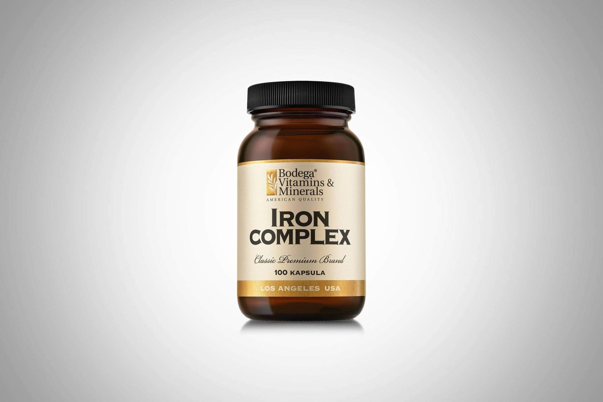
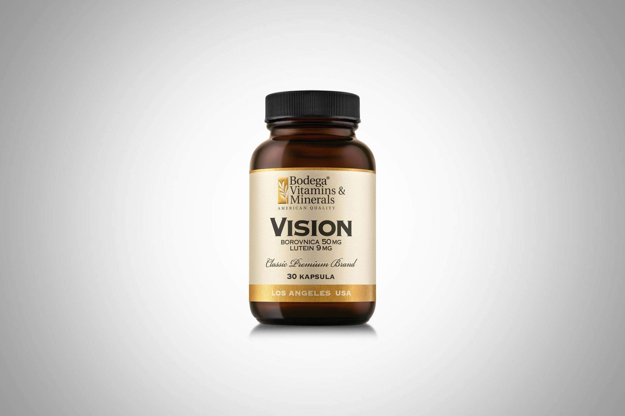
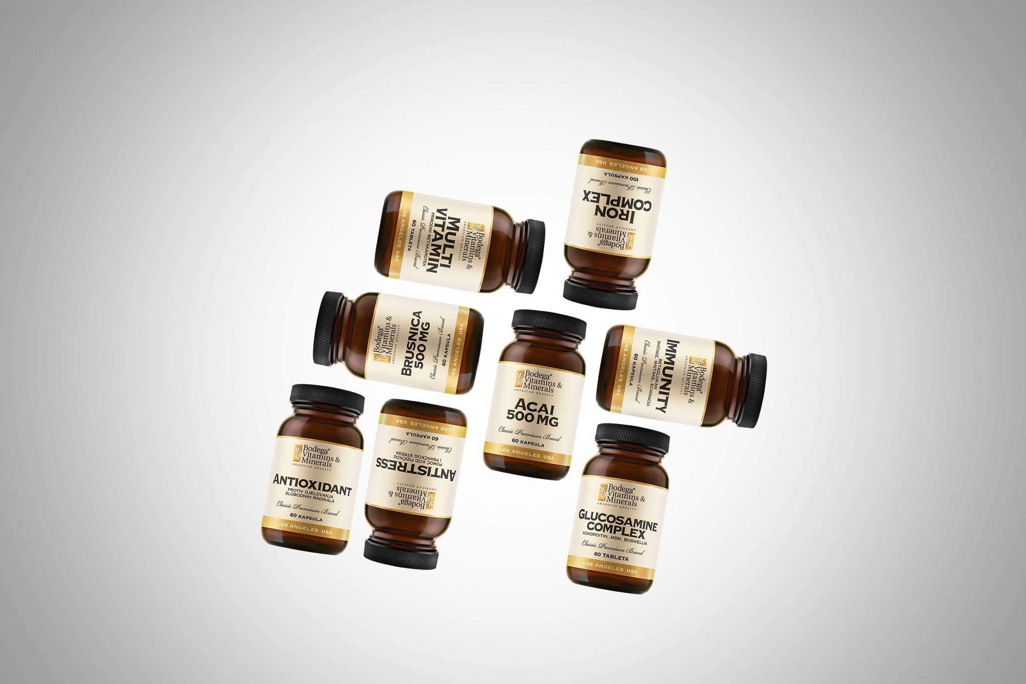
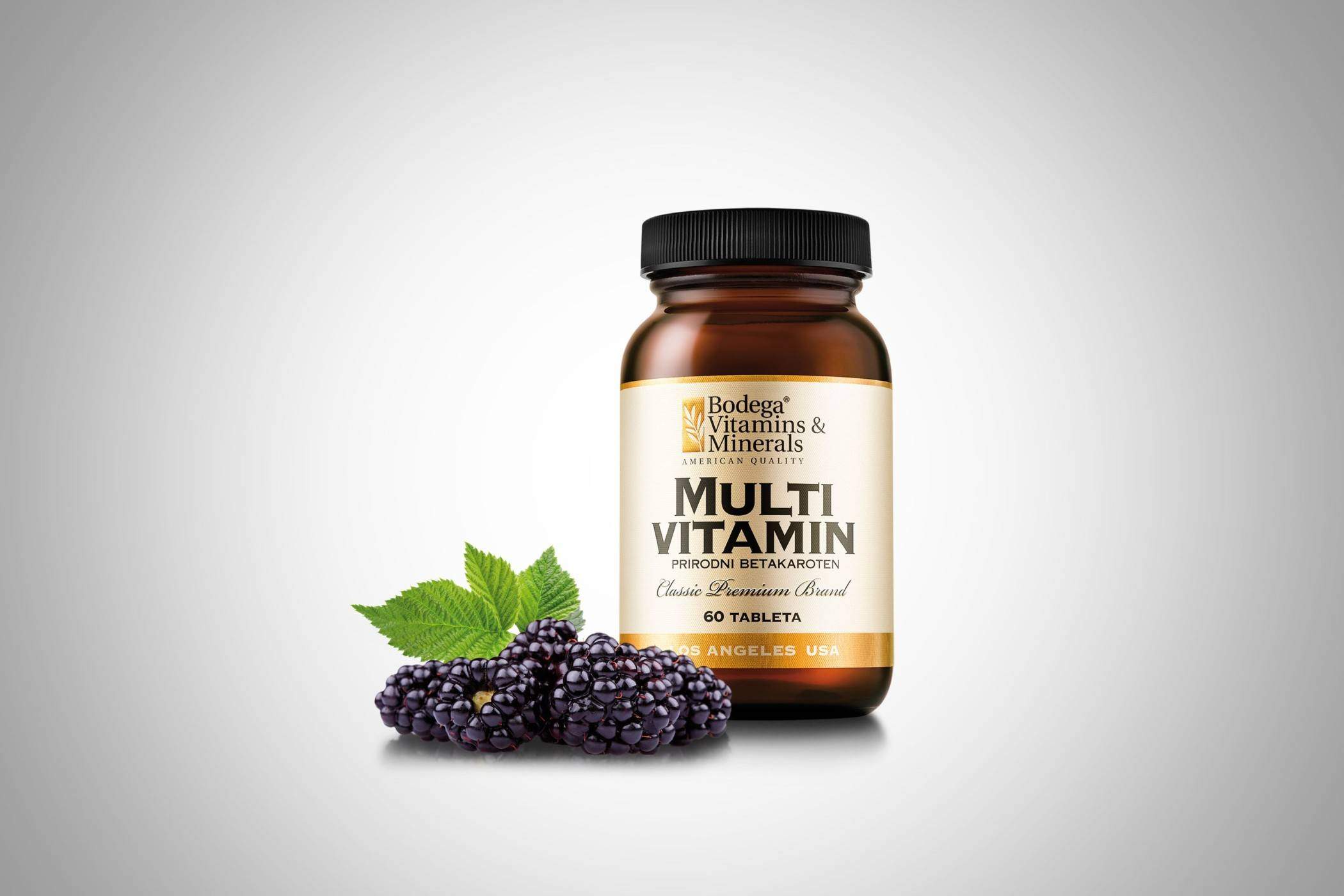
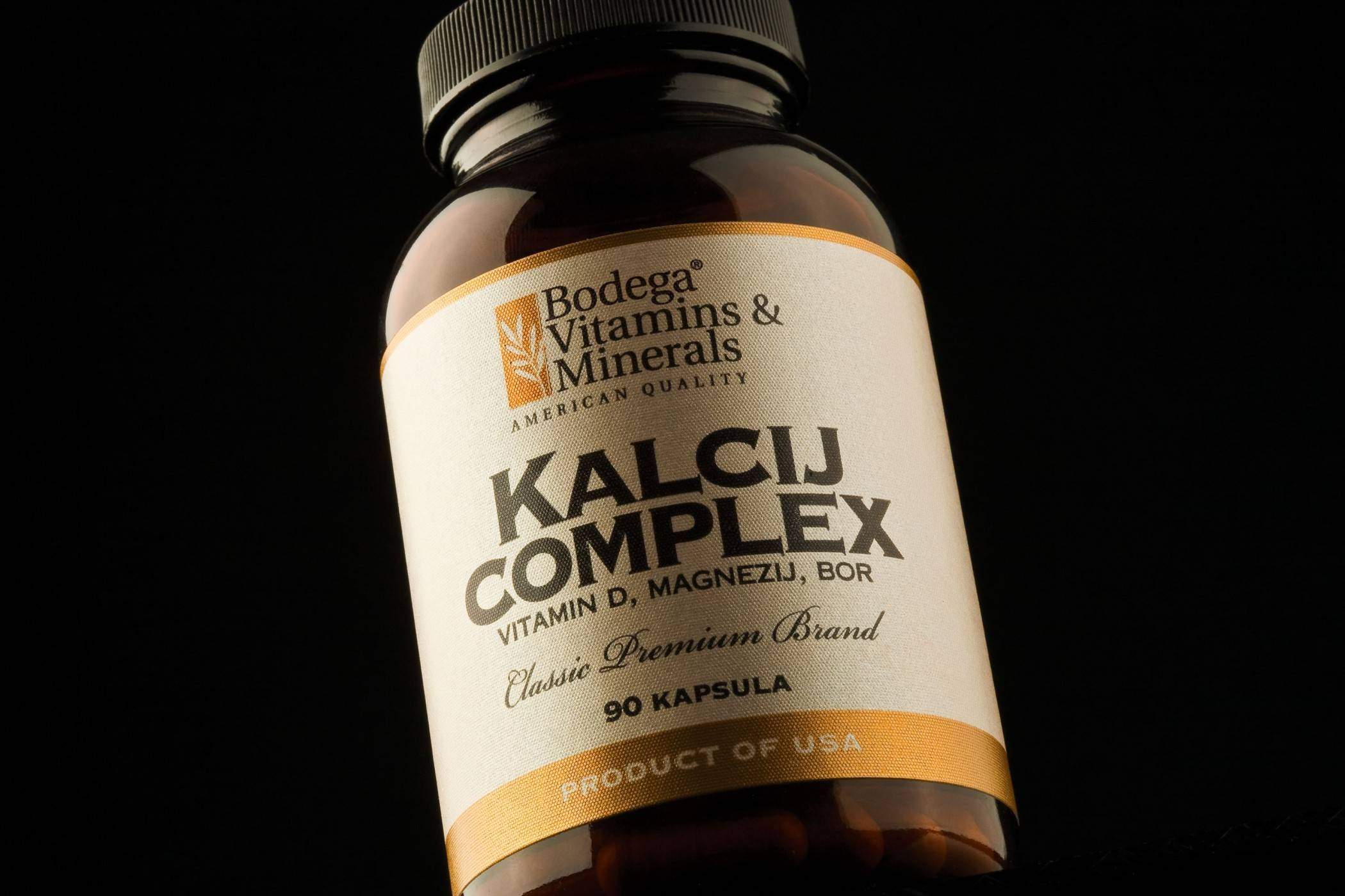
The packaging was designed in a way that immediately conveys that this is premium product. The label used a combination of metallic gold and pearly beige base that works very well with the chosen (standard) brown bottle. The intention was to encapsulate the quality and uniqueness of the product by completely paring down the design and using traditional typography, but choosing top notch materials, textures and printing techniques. The end result is a product that looks classy and convincing.
Brand positioning, Consulting, Naming, Packaging graphic design, Production support, Visual identity