Client:
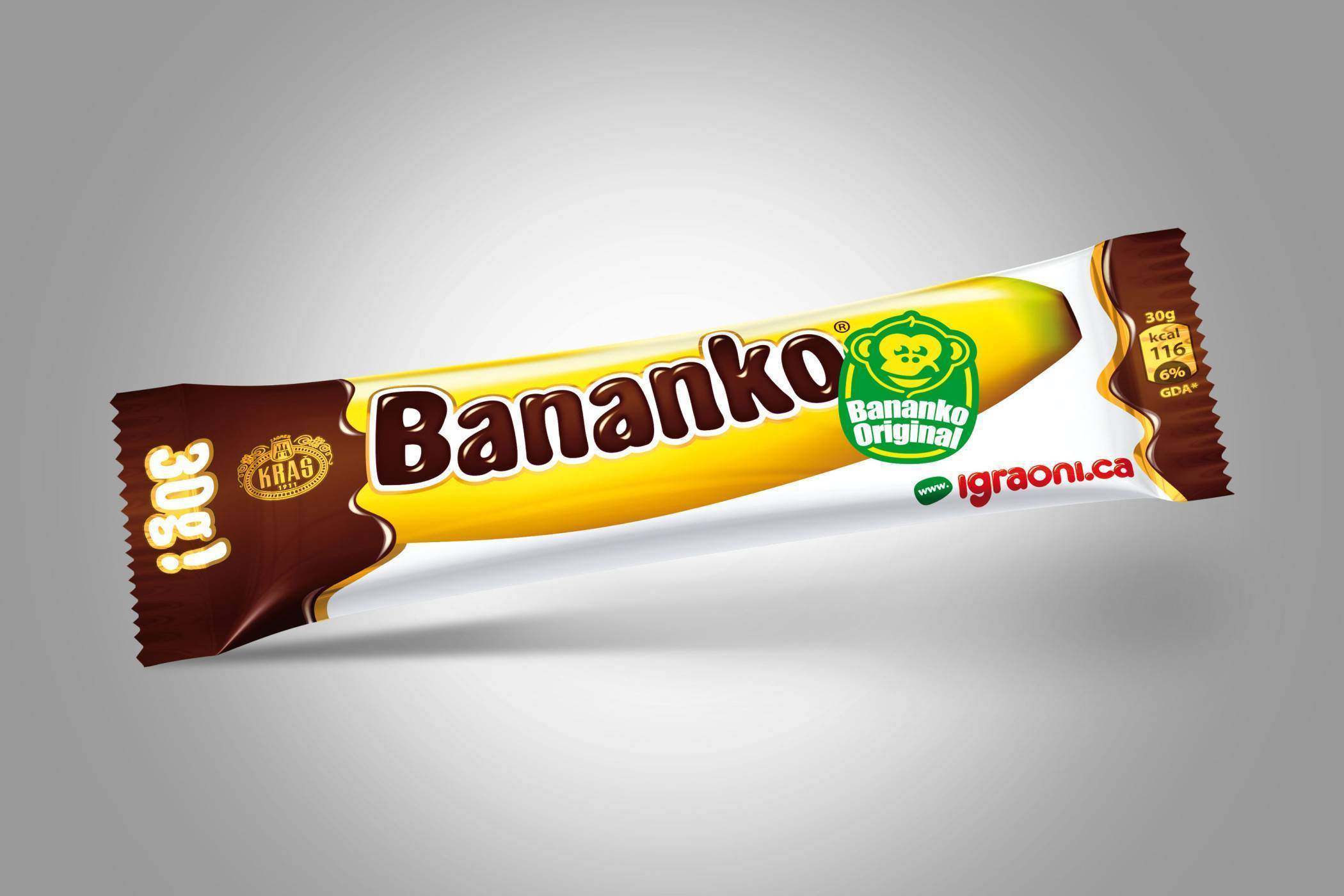
Redesigning the long-time favourite Kraš chocolate banana bar – Bananko. The aim was to give a fresher look to the product and strengthen the brand image in the region by creating a new logotype, but to keep the recognisable element of the adorable monkey.
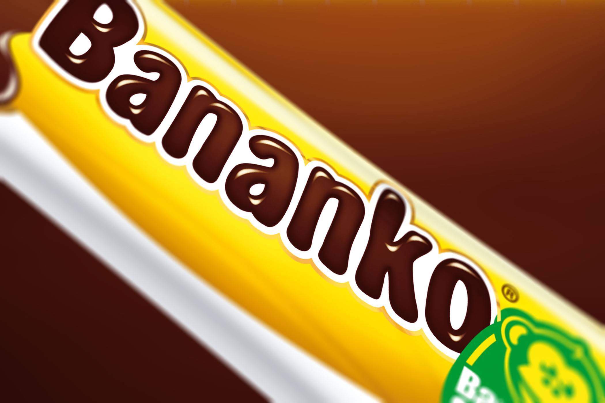
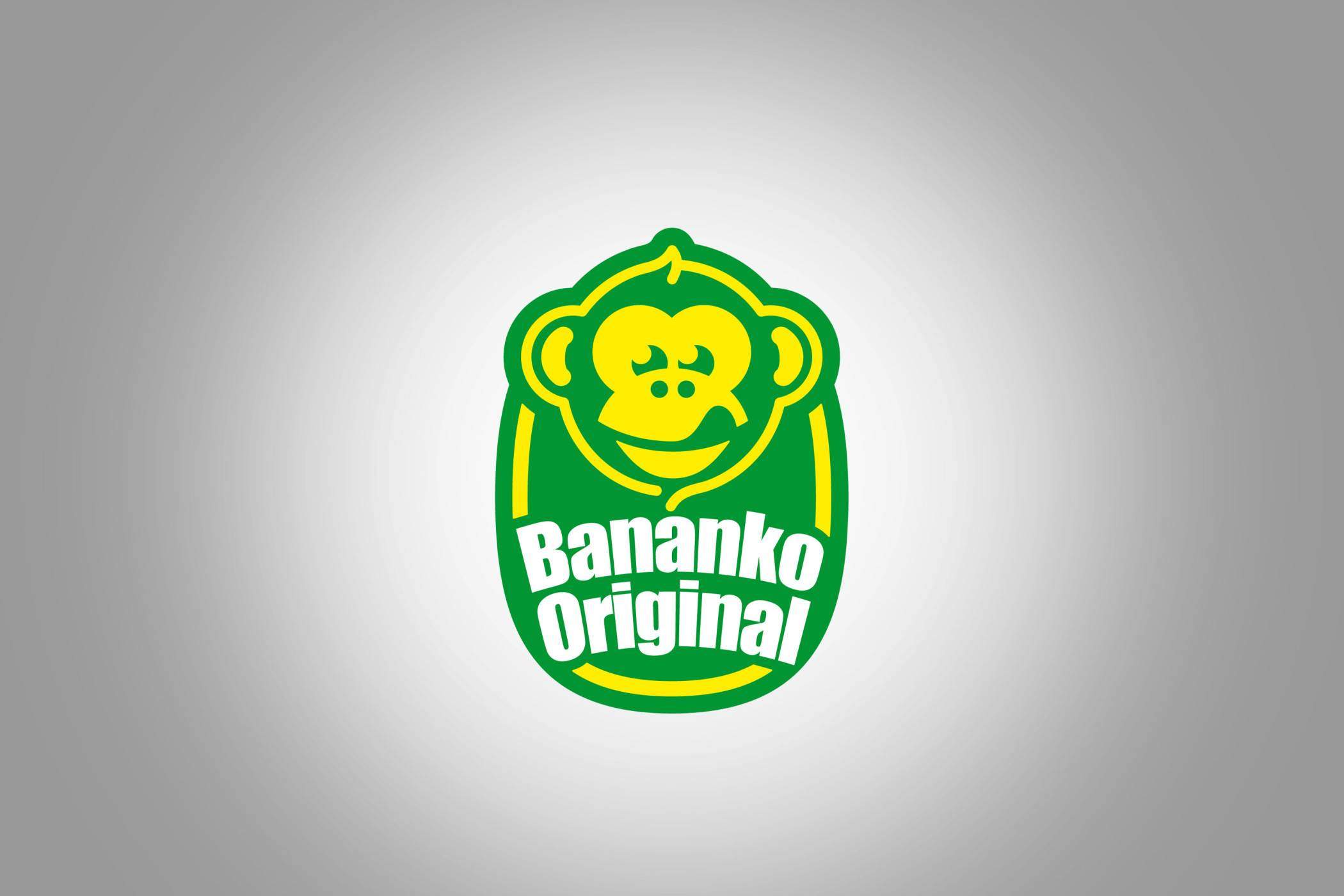
We wished to keep the design as simple as possible. Two main elements of the packaging were created: the image of the banana itself and the Bananko icon that was inspired by stickers found on actual banana fruit. We kept yellow as the basic colour, and the brown logo and wrapping edges that we introduced correspond with the chocolate coating of the candy bar.